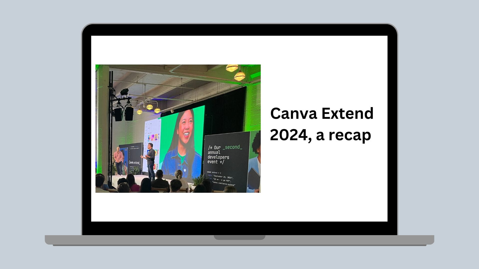
Flourish
Launching flourishcharts, our new interactive data visualization packages for data scientists
Interactive data visualization Python and R packages for data scientists.
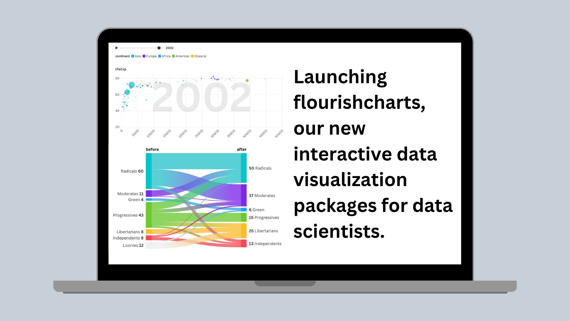
At Canva, data visualization plays an important role in how data scientists and other engineers present quantitative information. In February 2022, we acquired Flourish(opens in a new tab or window), a data visualization platform specializing in interactive data storytelling graphics. Today, we’re excited to launch flourishcharts – an open source interactive data visualization package available for Python and R.
Identifying a need
Data scientists at Canva had no easy way to create Flourish graphs inside their analytics notebooks. Other data visualization packages for data scientists (like Leaflet(opens in a new tab or window) and Plotly(opens in a new tab or window)) are quite popular, so we figured that we too could build similar packages for our internal data science team. We feel that this work will also enable other data scientists to empower the world to design through beautiful, interactive data visualization, so we’ve decided to open source this work for all data practitioners.
The packages allow enterprise data science teams to declaratively build interactive graphs in their existing coding workflow without needing to switch over to the Flourish website. R and Python users can now easily create racing bar and line charts, as well as other data storytelling pieces, inside their IDE of choice in RMarkdown and Jupyter notebooks.
Additionally, users can seamlessly integrate their data into existing Flourish graphs and collaborate with non-technical stakeholders by referencing the chart configuration from Flourish’s website in their R and Python coding session.
At Canva, our data science subspecialty has used the package to level-up interactivity in graphs and to add the wow-factor for stakeholder reporting. We feel that the packages have become increasingly useful for an external audience.
Package structure
As a starting point, the Flourish team had already provided a JavaScript-based API(opens in a new tab or window) for front-end engineers to embed visualizations in third-party websites. However this was not readily adopted by data practitioners who were unfamiliar with JavaScript as part of their workflow. Instead, data scientists at Canva would create Flourish graphs by downloading CSV files, adjusting the data to match the expected input format, and then uploading to the Flourish UI where the chart layout and other settings could be tweaked. The process was rather inefficient.
So, we looked at how we could wrap the JavaScript API in Python and R code. At its core, the JavaScript API is quite simple(opens in a new tab or window) - API users pass a list of parameters as JSON object with the following elements:
- The data objects containing a data frame or dataset.
- Data bindings telling Flourish which columns go where in a chart (such as column A on the X and column B on the Y axis).
- The chart layout configuration, such as colors and label formats.
This configuration is combined with a provided Flourish template(opens in a new tab or window), such as a line graph or heatmap, to produce the finished visualization.
We're able to interpret the expected data and configuration input of these templates by using a familiar tool for data analysis at Canva: jinja2. Jinja2 as a templating language is already used extensively for generating configuration for our data warehouse along with Snowflake and dbt(opens in a new tab or window). On a regular basis, we pull in the current template ID and version number for all Flourish templates and grab the metadata for each template at that point in time.
The Flourish template metadata contains all the potential arguments that you can pass to the JavaScript API. In a Python script, we download the JSON files containing metadata for all Flourish charts, wrangle the data into data frames and pass each argument for each chart type to jinja2 templates that render and write R and Python functions and documentation.
Users then define the data the graph requires and how the chart should look in their data science language of choice, without needing to understand the underlying API, for example:
In Python:
Flourish(chart_type = “scatter”).bind_scatter_data(data = gapminder,x = "Life expectancy",y = "GDP",color = "Region",size = "Population",name = ["Country"]).set_scatter_details(chart_layout_title = “Chart title”)
In R:
flourish(chart_type = “scatter”) |>bind_scatter_data(data = gapminder,x = "Life expectancy",y = "GDP",color = "Region",size = "Population",name = c("Country")) |>set_scatter_details(chart_layout_title = “Chart title”)
In essence, Python or R users need to specify a chart type, then bind the corresponding data and (if applicable) change the default chart settings. For example:
In Python:
Flourish(chart_type = “...”).bind_..._data().set_..._details()
In R:
flourish(chart_type = “...”) |>bind_..._data() |>set_..._details()
For example, the output in Python will look as follows:
Or in R:
Under the hood, the Python and R packages take the function arguments supplied by the end-user, convert them to lists or dictionaries, which are then converted into JSON, and passed to the JavaScript library to be rendered by notebook helper libraries (htmlwidgets in R and anywidget in Python).
Enabling collaboration between data scientists and stakeholders
The Flourish API allows coders to pull chart configurations defined in the Flourish app into their programming workflow. We’ve found that this provides numerous benefits to teams at Canva - designers and product managers are able to define how the chart looks and functions, while the data scientist passes the data locally from their data warehouse in Python or R. Data scientists don't need to upload data into Flourish’s website and can instead write over the default data provided in the web-based graph in Python or R.
Data scientists can do this by specifying the base_visualization_id in the flourish() function in Python or R. This must match the unique ID provided in published Flourish graph URLs.
Getting started
We’re very excited to rollout additional choices for interactive data visualization in R and Python. The quickest way to get started is to download the packages from PyPi (Python) or CRAN (R) and follow the documentation available at http://canva.dev/opensource/flourish-charts(opens in a new tab or window).
Both the R and Python packages are currently build on the Flourish Live API, which is an enterprise bolt-on for Flourish users. To use in your enterprise, please reach out to the Flourish team at Flourish — Let’s talk(opens in a new tab or window).