Recommended practices
We want to make it easy for you to integrate Canva into your product, while also adhering to the practices provided on this page. Canva has developed these guidelines to ensure all our shared users receive the same delightful experience.
General practices
Things to keep in mind while creating your integration.
Define clear integration goals and objectives
Before starting an integration, it's crucial to define clear goals and objectives. Identify clear use cases for your business to integrate with Canva and identify what data will be exchanged.
Integrations must be familiar extensions of Canva
The experience of the Canva integration should feel familiar, with the integration enhancing usability and not disrupting the workflow. Integrate Canva's features in a contextually relevant way to the user's workflow. Ensure the integration adds value and enhances the user experience.
Integrations must be secure
Your Canva integration must be a secure web app. Ensure that your integration's backend securely handles client information, and don't create integrations in environments where it's difficult to securely store credentials, such as a mobile app, desktop app, browser extension, Progressive Web App (with no backend), or Single Page App. Make sure that your integration follows the Security recommendations for the Connect APIs.
Don’t replicate Canva features
Your integration should enhance or add to the Canva experience, not replace any integrated products or features. Don’t re-create the Canva editor or the Canva UI.
Test and monitor the integration
Before deploying the integration, you must fully test the integration components, data mapping, and workflows. Testing can help identify and resolve issues before they become problems in production.
Provide efficient error-handling
Develop a comprehensive error-handling system that gracefully informs users of what went wrong and why. Don't confront or confuse the user with low-level system error messages. Provide guidance on troubleshooting common errors and known issues, including any relevant error codes or explanations.
Maintain performance
Maintain good system responsiveness for various user interactions, because poor performance can lead to a negative user experience.
Troubleshooting and support
Create a section dedicated to troubleshooting common issues that might occur during the integration process. Provide a list of frequently-asked questions (FAQs) and their solutions. Include contact information for support resources, such as customer support or community forums.
User experience (UX) practices
Prioritize a great user experience in your product. Understand who you're designing for and tailor the integration to their goals and needs.
Enable smooth user authentication
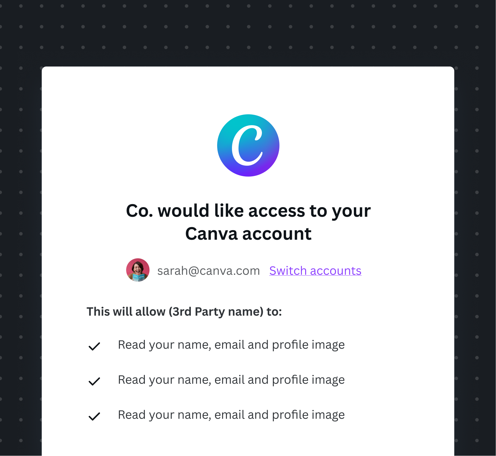
Make sure users can successfully connect to the integration, where completing the authentication process closes the window and returns them to a relevant part of your product. Unauthenticated users cannot access authenticated flows. Connected users should remain connected across all browsers and devices. For more information, see the User interface (UI) Guidelines.

Let users easily find the Canva integration button from your interface.

Let users authenticate using this screen, and close the window to return to the connected state.
Account and disconnection
Once the user grants access, inform them that their Canva Account is connected and being used. For clarity, display account details and offer a clear way to disconnect their Canva account within the integration.
Clearly show users that their Canva account is connected to your product. Allow users to disconnect their Canva account from your product in an appropriate part of the UI.
Design for the admin experience
Having an understanding of the journey that admins go through helps you design and create the best user experience for them. Provide a clear way for admins to discover, install, manage, and disconnect the integration on your product.
Consider accessibility requirements
Make sure your integration is usable by all users, including those with disabilities. Provide alternative text for images, clear button labels, logical keyboard navigation, and high-contrast colors. Refer to Canva’s Accessibility guidelines(opens in a new tab or window) to learn more on how we maintain minimum AA accessibility level across all our experiences.
Use clear, simple language
When describing your integration, you should:
- Focus on the user experience: What does the integration do? What can people use it for?
- Keep it simple: How much information are you trying to compress into your message? Is it too complex? Can you simplify it?
- Think about the user’s context: Will someone with no experience understand what you mean? What about those using your integration for the 100th time?
- Be specific: Do the words make it clear what the user can do, or what will happen next?
Provide consistent loading states
Sometimes it might take a while to load designs or folders from Canva, so use loading screens to make sure users understand this. Consider showing partial results loading for paginated resources, such as designs and folders, while waiting for additional pages to load.

Provide an indication that Canva designs or folders are loading, while the users wait.
Provide educational or help resources
Educate users on how to use Canva's features within your integration, through tooltips, onboarding UI, and links to documentation. In the documentation, include the value and benefits of using Canva in your integration and provide instructions on how to install, authenticate, and use the integration.

Add tooltips and helpful text to distinguish the designs and their actions.