Tables
Effective tables design focuses on the use case and the user experience. Tables are versatile, and they are helpful for a variety of use cases such as:
- Displaying complex datasets
- Providing clear data entry templates
- Formatting and styling diverse content
Understanding the user's job, and where the table has the strongest effect, is crucial for creating an intuitive and effective design.
Best practices

Design as a whole
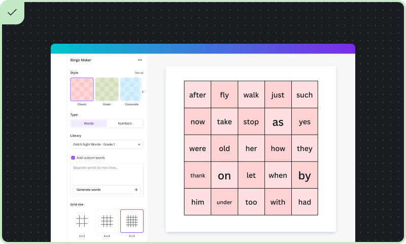
As much as possible, users should work on the table design as a whole, rather than tweaking individual table cells. Design the table with a strong foundation that allows the user to add fine detail as needed when they move toward their table design output. For example, the user could select a template, and gradually input their data and configuration as needed.
Make input intuitive
Consider the user's context when introducing the input UI for the table. Aim to make data entry seamless. For example, a teacher may want to generate a bingo class exercise by typing in content quickly. An accountant needs a way to upload a spreadsheet, automatically adding cell data to a table.
Ensure accessible table output
Ensure table design outputs are accessible. Wherever possible, add structure and constraints to ensure your users create designs visible to everyone. This may include high contrast and readable fonts. Refer to the Accessibility guidelines for more best practices.
Design pitfalls to avoid

Avoid ‘cell by cell' work
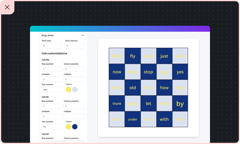
Avoid requiring users to create cells individually, or manipulate and merge cells or rows. Instead, introduce methods that streamline repetitive tasks, or add high-level settings to configure the table layout as a whole.
Avoid overcomplicating data entry
Avoid complex data entry processes that require multiple steps or advanced knowledge. Don't design a new tabular interface. Instead, follow interface and layout best practice that minimize the number of clicks and steps needed. See the Layout guidelines for more information.
Sometimes, your app may not complete the entire design for the user. The output can get the user far enough such that they can refine the design with Canva native features.
Ensure design outputs are easy to read
Don't use color themes or fonts that make it difficult to distinguish between cells or read the content. Ensure there is sufficient contrast between text and background colors, and maintain consistent styling to provide a professional appearance.
By following these guidelines, your app can creatively use tables as an effective UI pattern that's not only functional, but provides a positive user experience.