Search
If an app supports search, the experience should be consistent with Canva's native search experience. This page contains some guidelines to ensure this consistency.
For an example of how to implement this pattern, see the Storybook(opens in a new tab or window).
Filters with search
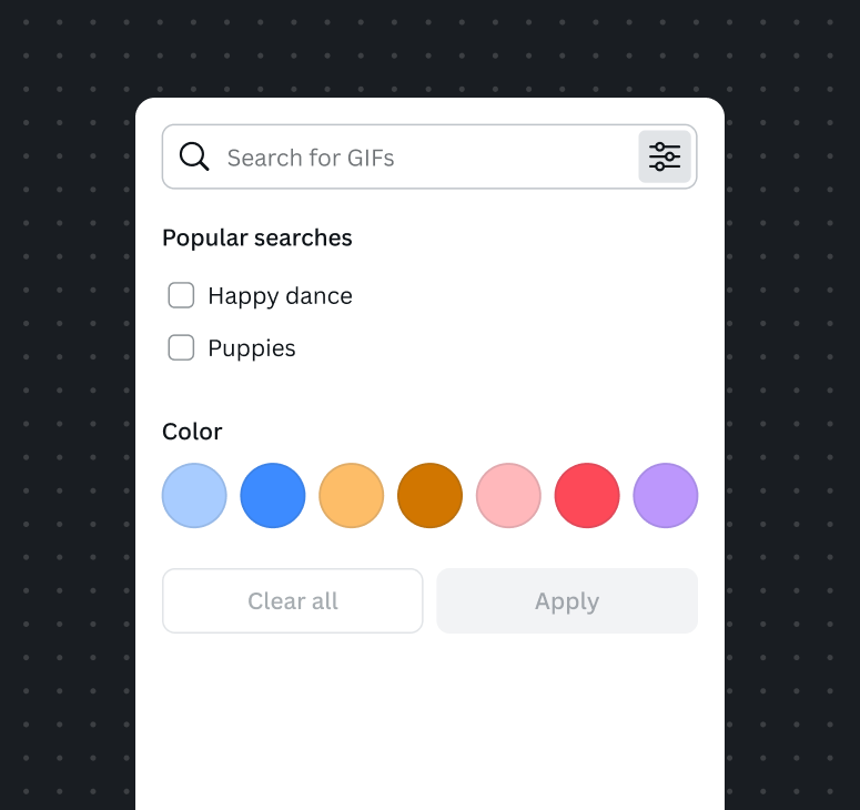
When using search and filters together, place the filter button inside the search input. Filter buttons in a search input should open a Dropdown Flyout.
It’s recommended that any elevated filters sit to the right of the search on desktop and underneath the search on mobile.


Filter with search best practices
- Let users know what they can search for.
- Use placeholder text to educate your users on what they can search for.
- Offer suggestions on how to maximize their search experience.
- Provide filters for searches or categorization for search results if it would narrow and improve a user's search results.
- Show the query inside the search field. Use a close button to close or reset the search.
- Show the results directly below the search field.
- Use an inline or grid layout to show results for visual media like images or videos.
- Let the user know if no search results have been found.
Applying filters
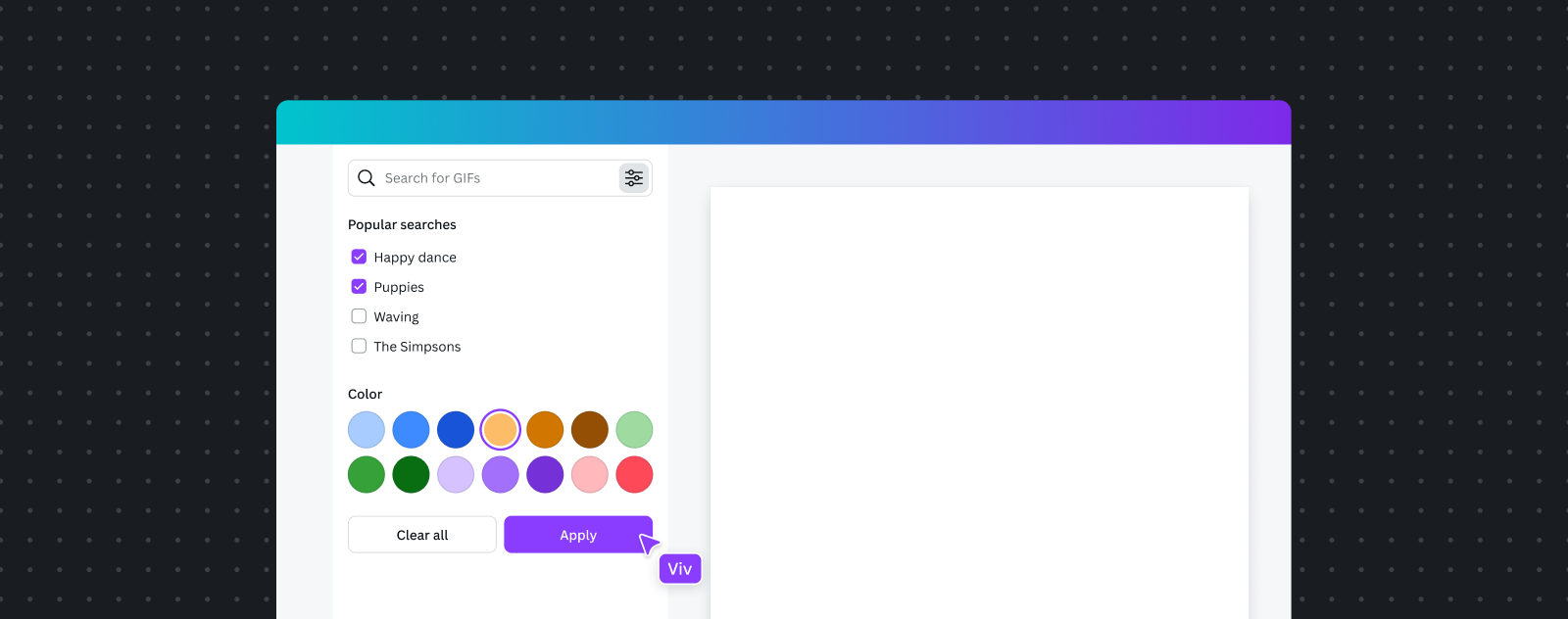
Applying a filter ideally takes immediate effect so users have instant feedback on their selection. This is also known as dynamic filtering.
When immediately applying filters isn't possible and requires a page load, use a strong call to action so the user knows to apply their selection. This is also known as batch filtering.

Clearing filters
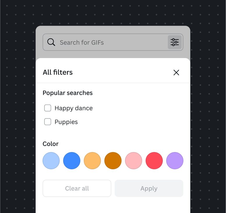
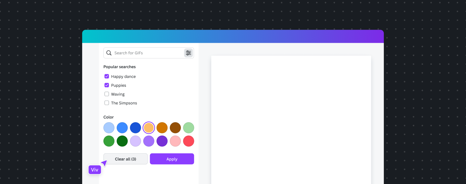
When there are multiple filters, allow users to remove filters through a “clear all” action in the filter bar and within the filter list.
When using a single select menu, provide the initial value in the list of options. For multi-select Select, provide a “clear all” action in the list of options.

Usage
Best practice
- Only provide filters that add value to the user’s task:
- Users exploring content typically value more elevated filters.
- Users retrieving content typically value less elevated filters.
- Use the most appropriate filter pattern for the scenario:
- Is the user looking for something specific? Consider using a search input.
- Is the user browsing content? Consider elevating more filters.
- Only provide filters that can apply to all content to avoid complexity and incompatible filters. If there are multiple types of content, consider separating them into different pages or views.
- Filters shouldn't navigate users to new pages or experiences.
- Avoid using tabs and filters together to filter the same type of content. If both must be used for this purpose, place tabs above filters, and as much as possible, keep filters persistent and relevant between tabs.
Content guidelines
- Prefer consistent written content for actions, e.g., “All filters”, “Clear all (n)”.
- Use simple, short, and singular filter labels where possible.
- Use the same labels for filters when shown in suggestions and the filter list.
- When a filter combination leads to no results, inform the user with an empty state message and an optional action to update or clear filters. Some examples of best practice include:
- "We can’t find any results, please try adjusting your filter combination or revising your search."
- "We can’t find any results based on your filters, please try a different combination."