Localization
When designing an app for a global audience, it's essential to consider how localization affects user experience. The following guidelines will help you create a user-friendly interface that adapts seamlessly to different languages and cultures.
Use the App UI kit
The App UI Kit was designed for a global audience. Using its components, patterns, colors, typography, and icons will help ensure effective communication across different languages and cultures.
Allow for text expansion
As text length can change with translation, keep calls to action and labels short and concise to ensure your interface adapts well.
To ensure your app displays properly in different languages, use the left-to-right and right-to-left pseudolocalization options in the Dev Toolkit. This simulates foreign languages by adding different characters and longer strings. After translation, preview your app in various languages using the Dev Toolkit.
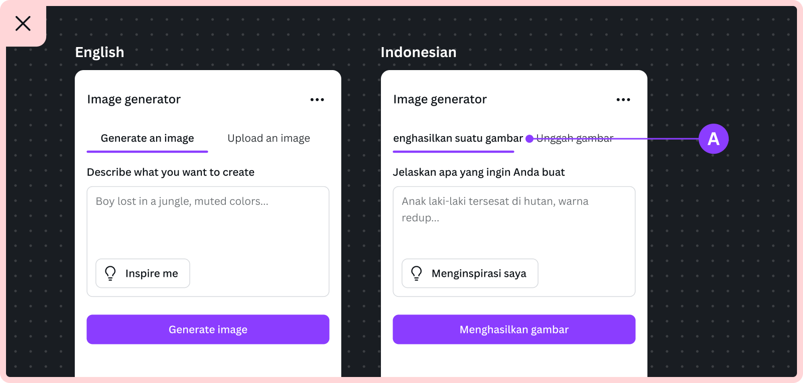
A For example, translating “Generate an image” from English to Indonesian increases the tab's length by about 40%, causing the text to overflow. In this case, using “Generate” might be a better choice.
Keep the language simple
Avoid using acronyms, abbreviations, slang, jargon, idioms, and jokes in your interface. These may not translate well into other languages, even if they're common in one culture.
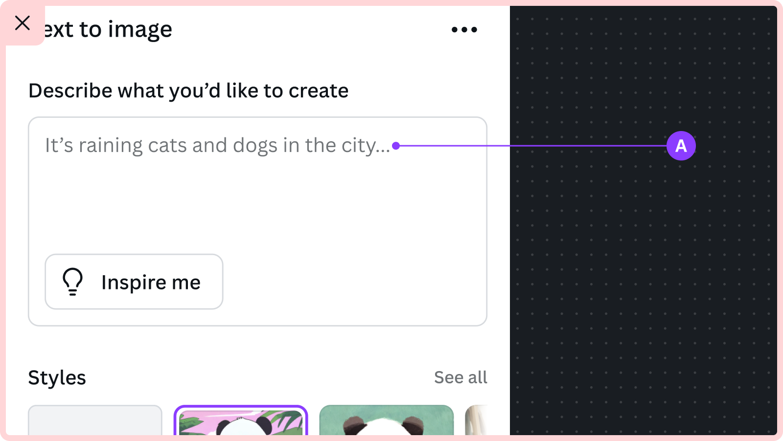
A For example, “It's raining cats and dogs” is an English idiom that describes heavy rain. This expression doesn't describe the actual weather, so it can be misunderstood or taken literally in other cultures, leading to confusion in translation.
Avoid multi-line clauses
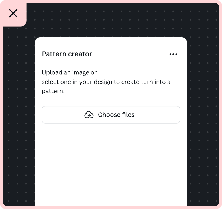
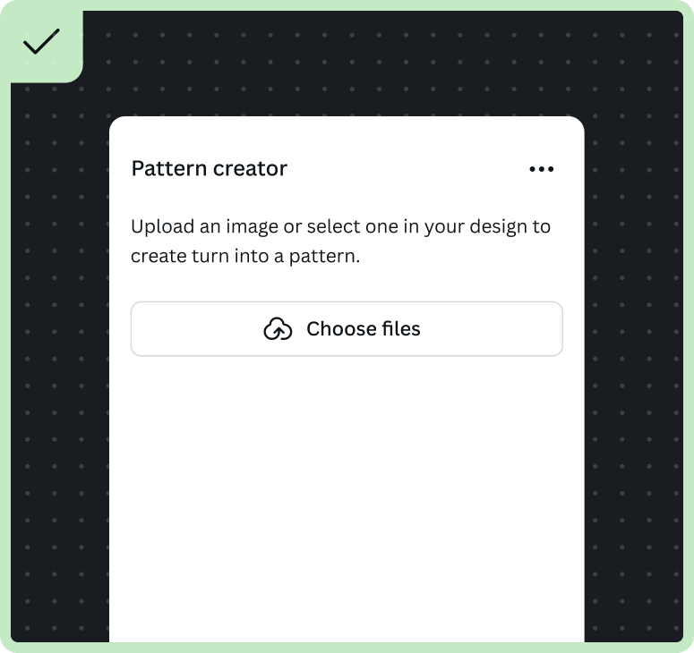
Breaking a single clause into multiple lines can lead to grammatically incorrect translations. Instead, let the line wrap naturally or divide the clause so that each part is grammatically independent.
Don't link entire sentences
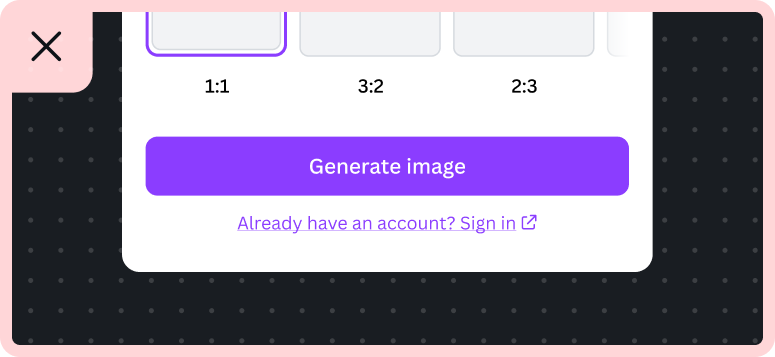
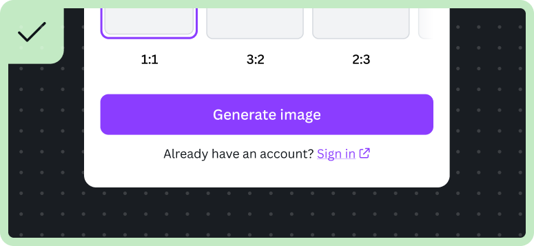
When adding links to text, only link the action or destination, keeping it as a single term or short phrase. Use the external link component for linking.
Review all images
If your app uses images for context, consider cultural sensitivities and ensure they're suitable and easily understood by a global audience. Consider these risks when using images:
- Flags: Different countries may recognize flags differently.
- Maps: Boundaries can be interpreted differently across countries.
- People: Pay attention to gestures, hands, and racial representations.
- Symbols: Be mindful of national, political, religious, or spiritual symbols.
- Cultural associations: Colors, numbers, names, and events can have varying meanings.
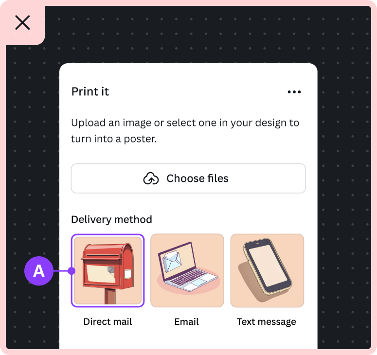
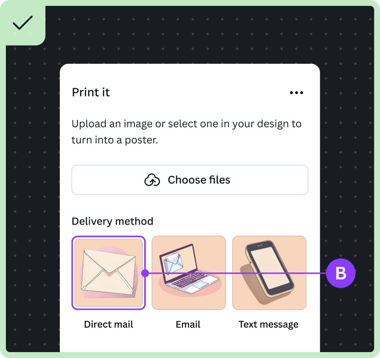
For example:
A Mailboxes vary widely in design, color, size, and placement across different countries.
B An image of an envelope to represent "direct mail" might be a more globally understood choice.
Keep text out of images
As text in images can't be translated, using such images in your interface can undermine your app's localization efforts.
This example compares how text can appear outside an image, allowing it to be translated:
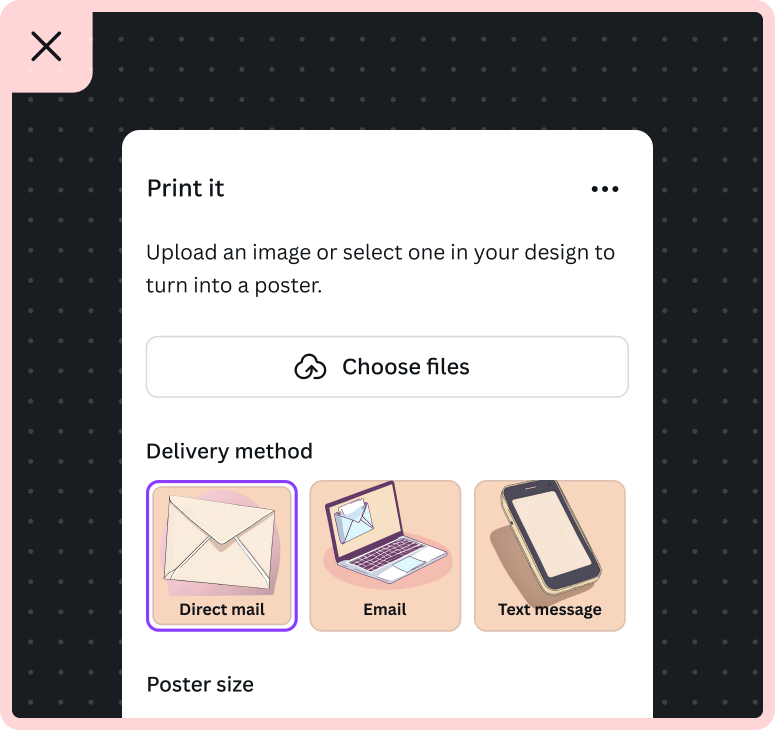
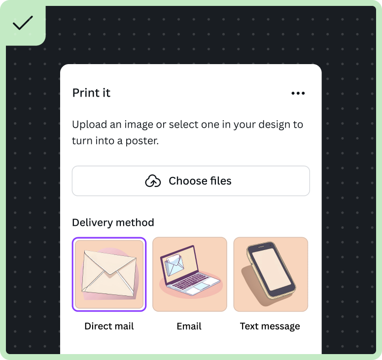
- Do position text outside of images and near the relevant thumbnail.
Localize numbers, currencies, and dates
Numbers
- Use numeric digits (for example, 12345) instead of words for numbers.
- Use the recommended i18n tooling when displaying numbers. The tooling automatically adds the correct digit group separator for large numbers, depending on the locale (for example, 3,500 in English).
- Spell out single-digit numbers if they start a sentence. e.g. Seven.
- Write number sequences or ranges consistently.
For more information and examples, see Numbers.
Credit usage
If your app requires users to spend credits to generate a design or perform an action, make sure to specify the number of credits that will be used for the action, and the total or remaining credits they have available. We recommend the format: “Use X of Y [App name] credits” to clearly communicate how many credits will be spent from the total available.

A For example, "Use 5 of 50 credits" means 5 credits will be spent from a total of 50 available to generate an image.
For example ICU syntax, see Pluralization.
Decimals and fractions
As a general rule, use rounded numbers. If rounding isn't possible, use the fewest decimals or spell it out as a fraction.
Do | Don't |
|---|---|
$29.97 | $29.9784 |
Two-thirds | 2/3 |
Percentages
Use the % symbol instead of spelling out 'percent'.
Do | Don't |
|---|---|
50% | 50 percent |
Phone numbers
If you need to reference a phone number:
- Use country codes for clarity
- Use spaces between sets of numbers
Country | Code | Example |
|---|---|---|
United States | +1 | +1 702 XXX XXXX |
Australia | +61 | +61 473 XXX XXX |
Ranges and spans
Use 'to' between a range of numbers. If space is limited, use an en dash with no spaces on either side.
Do | Don't |
|---|---|
3 to 4 days | 3 - 4 days |
3–4 days | 3—4 days |
Measurement
If your app displays measurements, we recommend using the metric system for a global audience. If you choose to use the imperial system, ensure it's applied consistently throughout and avoid mixing metric and imperial units.
Temperatures
- Use numerals and the word 'degrees' for temperatures.
- Specify Celsius or Fahrenheit the first time you mention a temperature.
- Don't repeat the word 'degrees' if it's already implied or if you've included the degree symbol.
- If space is limited, use the degree symbol and abbreviate the temperature scale.
Do | Don't |
|---|---|
30 degrees Celsius | 30 degrees |
30°C | 30° degrees Celsius |
Currencies
When displaying prices, either specify the currency of the item's origin or ensure your audience sees a localized price. For your app's pricing, use the Link(opens in a new tab or window) component to link to your website, where the price can be shown in the user's local currency format.
Dates
If you're just displaying a date with no other message content, you can just use <FormattedDate/>(opens in a new tab or window) or intl.formatDate, so that users can see dates that reflect their localization settings.
Use the DateInput(opens in a new tab or window) component so that users can see dates that reflect their localization settings.
In cases where a date is displayed rather than selected, there are 4 standard time formats you can use:
Format | Description | Example |
|---|---|---|
short | A numerical format | 1/3/24 |
medium | Includes the month's name with abbreviation | Mar 1, 2024 |
long | Includes the month's name without abbreviation | March 1, 2024 |
full | Includes the name for the month and day of the week | Friday, March 1, 2024 |
For more information and examples, see Dates.
Localize times
Use the following format for times, letting your audience see times that reflect their locale.
There are 4 standard time formats you can use:
Format | Description | Example |
|---|---|---|
short | Includes hours and minutes | 10:40 AM |
medium | Includes hours, minutes, seconds | 10:40:29 AM |
long | Includes hours, minutes, seconds, and time zone | 10:40:29 AM GMT +10 |
full | Includes hours, minutes, seconds, and time zone | 10:40:29 AM GMT +10 |
To indicate a time range, use the word 'to' instead of a hyphen. Avoid using words like 'last' and 'next' when you write about time. For example, the phrase 'during the last month' could mean during the previous month or during the final month.
Do | Don't |
|---|---|
9 AM to 5 PM | 9 AM-5 PM |
previous month | last month |
For more information and examples, see Time.
Time zones
Use the Coordinated Universal Time (UTC) offset to ensure dates and times are correctly adjusted for the user's location.
More information
- Overview of the localization process: Localization overview
- Learn how to use the recommended workflow: Recommended workflow
- Learn how to localize an existing app: Migrate an existing app
- Review the supported syntax and exceptions: ICU syntax