Design guidelines
Fundamentals
Alerts & messaging
Guidelines for displaying alerts and messaging.
Alerts highlight important information that the user needs to see, such as errors. They provide medium-priority messaging throughout the product and remain on screen until dismissed, an action is selected, or the app deems it suitable to remove them (for example, moving from one page to another).
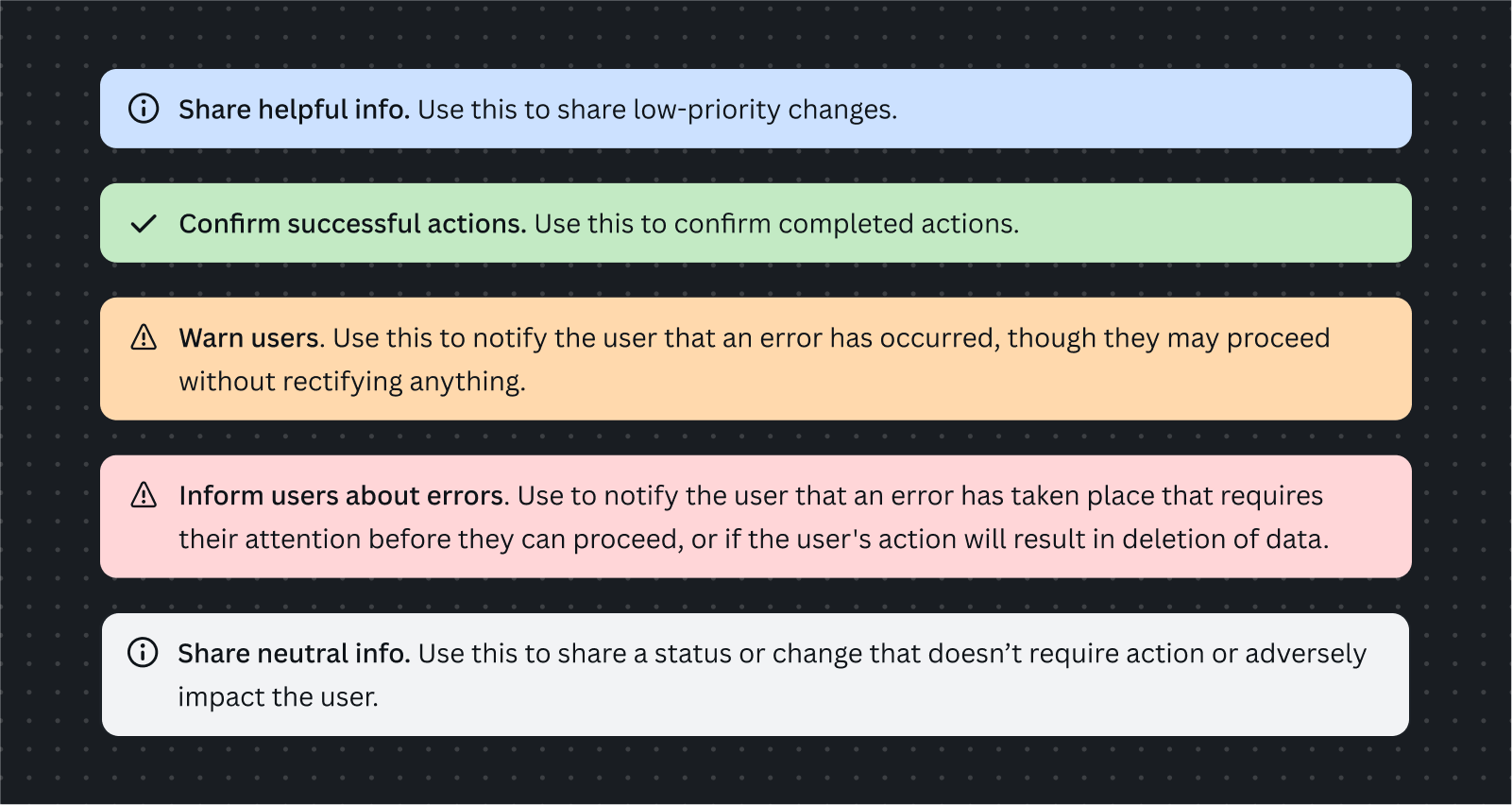
You can also use alerts to communicate other types of messaging, such as warnings, success messages, or informational messages. We use colors and icons to differentiate these:

Examples

- Use the blue info alert when notifying the user of neutral information.
- Use the green success alert when notifying the user that a successful action has taken place.

- Use the gold warning alert when notifying the user that an error has occurred, though they may proceed without rectifying anything.
- Use the red error alert when notifying the user that an error has occurred that requires their attention before they can proceed, or if the user's action will result in the deletion of data.