Written content guidelines
One of the most important ways a user first experiences your app is through the written content when they find the app on the Apps Marketplace.
- Highlight the use case: When users read your app's content, they want to understand the problem your app addresses, whether it aligns with their needs, and what sets it apart from others.
- Ensure readability: Make the written content easy to read by using plain language and concise sentences.
App name
To avoid confusion with Canva products or other apps in the Marketplace, make sure to follow these rules when naming your app.
- Don’t begin your app's name with "Magic".
- Don’t include the words "Canva" or "Pro" anywhere in the name.
- Keep the name under 10 characters, including spaces. Longer names may not display properly.
- Make sure the name is unique and doesn’t conflict with existing apps in the Apps Marketplace.
- If your app references an external platform, match the platform's registered brand name, including spelling and capitalization.
- Use the app's name consistently in all your messaging.
- Don’t use emojis.
Short description
The short description should explain what the app does at a glance because it appears before a user selects the app to learn more about it. It appears below the app’s name in the Apps Marketplace.
- Avoid acronyms, initialisms, abbreviations, slang, and jokes because they’re confusing and don't translate well.
- Write the description in plain text without line breaks because formatting is not supported.
- If your app short description is one sentence, don't end the short description with punctuation, such as a period, exclamation mark, or question mark. For app short descriptions with two or more sentences, add punctuation to each.
- Use sentence case: Capitalize only the first word of each sentence, plus any proper nouns and acronyms.
- Don't use emojis.
Short description examples
Do | Don't |
|---|---|
Instantly generate images and videos with AI | The best AI app for image and video generation |
Add slow motion effects to your video | Add slo-mo effects to your vid 🐌 |
Add animated GIFs from Giphy to your designs | Add Animated GIFs From Giphy To Your Designs |

Tagline
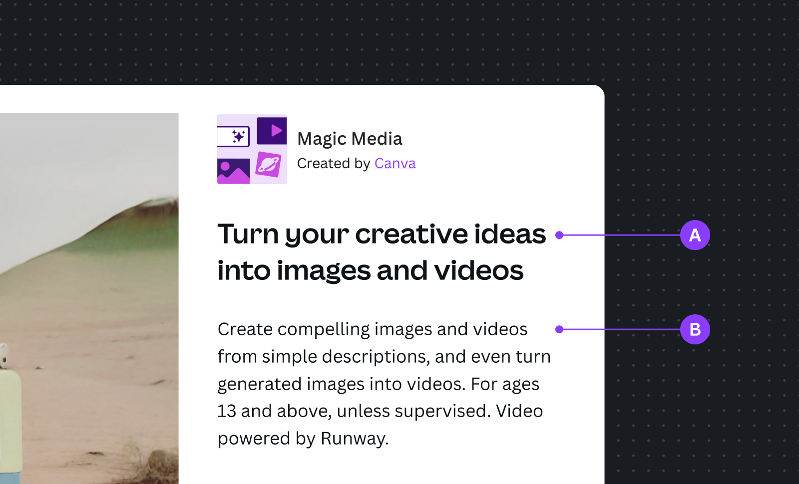
A tagline is similar to a short description and helps users quickly understand what your app does. It appears on the modal when users select your app from the Apps Marketplace.
- Describe what the app does, not what’s great about the app.
- Don't include marketing claims of any kind. For example, don't describe the app as the "world's most popular" app in its category.
- Use sentence case: Capitalize only the first word of each sentence, plus any proper nouns and acronyms.
- Don't use emojis.
Tagline examples
Do | Don't |
|---|---|
Turn your creative ideas into images and videos | Revolutionary designs, quality images and videos, endless possibilities! |
Translate text to voiceovers in multiple languages | Discover new ways to communicate 🗣️ |
Enhance designs with Giphy GIFs | Enhance Designs With Giphy GIFs |
Description
Users can see the app description below the tagline, once they’ve selected your app to view or learn more. It’s an opportunity to describe your app's functionality in more detail. This is also the best place to describe what your organization does in general, or highlight features that exist outside of the app.
- This description will be translated, so the shorter it is, the easier it will be to translate into languages that require more characters to convey the same meaning.
- Be consistent with the purpose described in the app tagline and short description.
- Use "design" to describe what a user is creating in Canva.
- End the sentences with punctuation (a period, exclamation mark, or question mark).
- Write the description in plain text without line breaks because formatting is not supported.
- Don't include marketing claims of any kind. For example, don't describe the app as the "world's most popular" app in its category.
- Use sentence case: Capitalize only the first word of each sentence, plus any proper nouns and acronyms.
- Don't use emojis.

A Tagline: Highlight the key use case for your app.
B Description: An opportunity to describe your app in more detail.