CSS
CSS: Absolutely positioning things relatively
Using CSS grid to render complex webpages responsively.

Responsiveness is hard
As software engineers, we have a plethora of tools available to control the rendering of a webpage (Introduction to CSS layout(opens in a new tab or window)) and can easily create bespoke user interfaces for different devices (Using media queries(opens in a new tab or window)).
An experienced web developer can manually convert a single design into a set of HTML + CSS that will look great on both your laptop and your mobile phone.
However, Canva is a design platform where users can create designs by freely dragging and dropping elements using our fixed dimensions editor.
We've been experimenting with whether we can render any design our users can imagine, responsively on any device, and it led us down an interesting path of combining two seemingly contradictory positioning systems: absolute and relative positioning.
Let me explain using one of our beautiful templates(opens in a new tab or window).

As you can see, Canva offers such a rich array of elements that users can position anywhere, overlapping, inside other elements, etc.
The engineer in you is probably already slicing this up, converting parts to backgrounds, nesting elements, and figuring out which layout techniques to apply to different sections.
Our challenge is whether we can do this automatically at scale. Can we take any design and render it responsively? And just for a challenge, can we do all this without JavaScript?
Easy, absolute positioning to the rescue
Given the complexity of the design (and this is a simple example), we don't really have a choice but to absolutely position the elements using percentages of the screen width, which works perfectly when scaling.

But this clearly becomes unreadable on smaller devices. There are a few optimizations we can make, but there's one big problem: the text becomes impossible to read. The user would need to zoom in and scroll around horizontally and vertically to try and consume the content.
Let's try and fix it. We'll scale everything except the font size to ensure it's legible.

Ah, of course, when we position elements absolutely, they're removed from the normal document flow, and no space is created for the element in the page layout. The text doesn't expand the surrounding background as we expect, and it overlaps other elements.
The normal flow
So, we're stuck between choosing an absolute positioning system, which respects the user's layout, inferring some complex relationship between all the elements, or leaving it up to the browser's normal flow, which won't look like the original design.
We need a simple absolute positioning system, but the reflowing text should influence the position of other elements.
That is, the best of both absolute positioning and the normal relative flow.

Our friend: the CSS grid
You can read the basic concepts of grid layout(opens in a new tab or window) if the CSS grid is new to you, but it does what it says on the tin. It's normally used to arrange content by a defined set of rows and columns.

But what if we flipped this? What if we first look at the position of the elements that we want to render and then create all the columns and rows from them.
Let's take a simpler design.

From this design, we can infer that we need the following rows and columns.

To calculate the grid-template-columns, we calculate the offset as a
percentage of the design/screen width from the previous column. That is:
- The Canva logo is approximately 31% offset from the left design edge.
- The Canva logo's width is approximately 14% of the design.
- The gap between the notebook and the logo is approximately 10% of the design.
- The notebook is approximately 13% of the design.
- There's a void of approximately 31%.
In CSS, we can define this as follows.
grid-template-columns: 31vw 14vw 10vw 31vw;
And we can do the same for rows, using the screen width as our constant.
grid-template-rows: 12vw 13vw 4vw 14vw 12vw;
We can then give the Canva logo a grid-area,
grid-area: 2 / 2/ 3 / 3, rendering it exactly as we expect.
Our example behaves exactly like absolute positioning, but with one key difference. The offsets are relative to the previous row or column, which provides us with a lot more flexibility (pun intended — keep reading then feel free to groan 😊).
We can now render our original design using a sophisticated set of rows and columns.

You'll notice that a lot of the content is aligned at the same point on the x-axis. For example, the Instagram icon and picture of the chair.
At first, we didn't know how we were going to support this in the grid, but it turns out the grid supports zero-width rows and columns, allowing us to create an infinite number of coordinates. It also allows us to control the ordering of such elements, determining which elements impact the position of others.
grid-template-columns: 5vw 0 0 1vw;
Adding relativity via max-content
For our second trick, we can now make a small tweak to our
grid-template-rows adding a minmax range.
grid-template-rows:minmax(12vw, max-content)minmax(13vw, max-content)minmax(4vw, max-content)minmax(14vw, max-content)minmax(12vw, max-content);
What's going on here? Some definitions:
minmax: defines a size range greater than or equal to min and less than or equal to max.max-content: this sizing keyword represents the intrinsic maximum width or height of the content.
We now define our rows as any value greater than or equal to the original dimensions in the design and less than or equal to the size of the content the text or element wants to consume, given the width available for rendering (the normal flow-ish).
It's probably best to show you.

Voila! Using max-content we can begin to expand the rows. Given that
all other rows are positioned relative to the previous one, we avoid
elements overlapping and get a responsive experience.
We've absolutely positioned everything relative to each other. All in pure CSS.
There's more to responsiveness than just text
So far, so good. We can render text and rely on the browser to reflow and not disfigure the user's design too much.
However, users would expect the layout of the content to also adjust between landscape and portrait viewports. In the previous example, the text stretching creates a lot of empty space between the picture of the chair and the social media icons. If we could rearrange the content from two columns into one, we could remove the empty space.
Introducing our new friend (CSS grid) to our old friend (CSS media queries)
Media queries work by creating a set of styles that apply for a given viewport width, as shown in the following example.
/* set all text color to red for screens between 200 & 400px wide */@media screen and (min-width: 200px) and (max-width: 400px) {color: red;}
Media queries allow us to create breakpoints and recalculate the grid for a given device.

It's clear to the human eye that our content doesn't fit on mobile or tablet screens, and we need to alter the layout of the content.
We've also been busy creating a couple of algorithms to determine the logical reading order of the content and calculate when elements are out of bounds for a given screen size, but this is a relatively simple example and we expect the content on the right to wrap on to a new row.

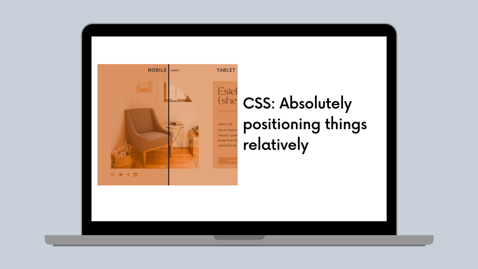
You can see all the breakpoints kicking in as the available width changes. Our backend algorithms can reconfigure the content and produce a different grid layout for each screen size, allowing everything to move around.
/* layout on mobile */@media screen and (max-width: 440px) {#grid {grid-template-columns: 5vw …grid-template-rows: minmax(6vw, max-content)…}#element1 {grid-area: 2 / 3 / 5 / 6}}/* layout on tablet, with different grid template */@media screen and (min-width: 441px) and (max-width: 880px) {#grid {grid-template-columns: 10vw …grid-template-rows: minmax(16vw, max-content)…}#element1 {grid-area: 4 / 5 / 9 / 10}}/* layout on desktop, etc */@media screen and (min-width: 880px) {#grid {grid-template-columns: 14vw …grid-template-rows: minmax(11vw, max-content)…}#element1 {grid-area: 3 / 4 / 19 / 21}}
* Note: dummy values to illustrate the concept
Responsiveness is a little less hard and we didn't need JavaScript
With all these techniques combined, we are really proud of our approach to responsiveness and excited to launch it as part of our Websites product(opens in a new tab or window). I'm constantly surprised by how much you can do in CSS if you push the boundaries a little bit and get creative.
We enjoyed thinking about the grid and responsiveness differently, and hopefully, you did too.
Acknowledgements
Shoutout to David Copley(opens in a new tab or window), Camellia Wong(opens in a new tab or window) and Nic Barker(opens in a new tab or window) for their help along the way.
Interested in solving challenging frontend engineering problems? Join Us!(opens in a new tab or window)


