Design Systems
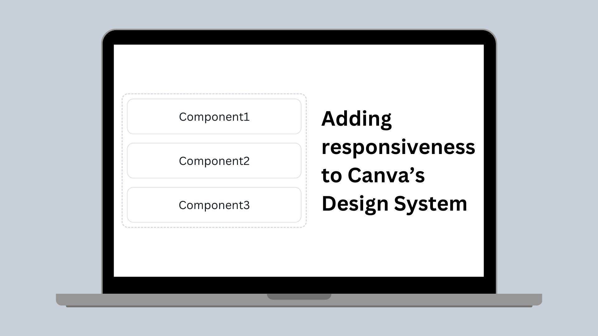
Adding responsiveness to Canva’s Design System
How we use the CSS cascade to enable building responsive layouts
At Canva, our Design System (which we lovingly call Easel) serves a few purposes:
- Consistency: Our components behave consistently across the product, bringing consistency to Canva.
- Composability: Our components have defined responsibilities so that we can compose them in ways that serve the needs of the product.
- Efficiency:
- Building a component once discourages engineers from building their own, decreases the bundle size of the Canva application, and reduces the time it take for pages to load.
- Product designers and engineers have a shared basis from which to start their conversations.
Our layout system
Some of our core principles for creating consistent layouts include:
- A set spacing scale (using 8px grid units)
- Defined breakpoints (small: 600px, medium: 900px, large: 1200px. For more information, see The 100% correct way to do CSS breakpoints(opens in a new tab or window)).
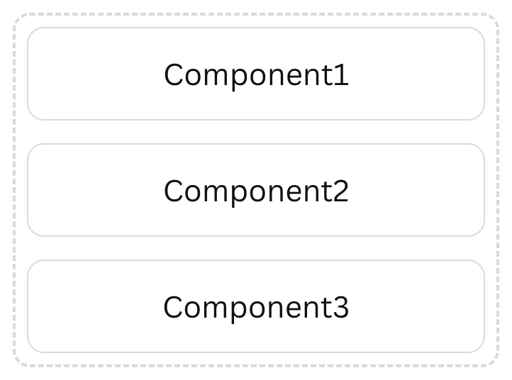
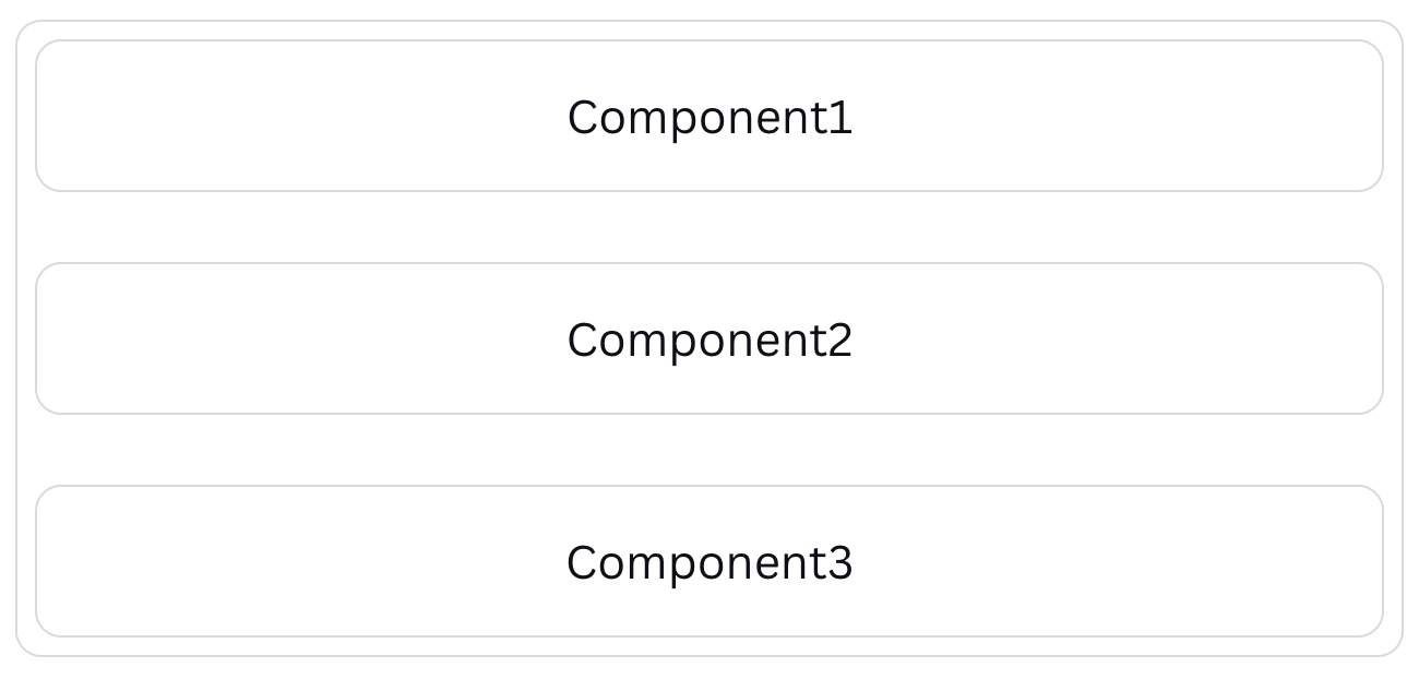
From these principles, we provide layout components that leave our engineers to focus on more important things. For example, we have a Rows component that places components vertically (in rows).
<Rows spacing="2u"><Component1/><Component2/><Component3/></Rows>
As well as making it easier to construct layouts with a high degree of consistency, the components also provide a simple and consistent language between designers and developers.
Diving into a simplified version of how this looked, we applied a default class to set display: grid and width: 100% and another class conditionally setting the row-gap property.
function Rows({ children, spacing }) {return (<divclassName={classNames('rows',`spacing${spacing}`,)}>{children}</div>);};
.rows {display: grid;width: 100%;}.spacing0 {row-gap: 0px;}.spacing1u {row-gap: 8px;}.spacing2u {row-gap: 16px;}.spacing3u {row-gap: 24px;}.spacing4u {row-gap: 32px;}
Therefore, <Rows spacing="2u"> renders as follows.
<div class="rows spacing2u"/>
Although this solution worked well to address layouts, we also had to address responsive design. If components are going to be spaced further apart on larger screens, our components should be able to provide that flexibility.
Designing a solution
The next step was deciding what a good solution should look like. We had 2 hard requirements: an understandable API and for it to be SSR friendly, which meant using CSS media queries.
Designing the API was simple enough. Taking inspiration from Braid(opens in a new tab or window)’s “responsive props”, we could use the existing spacing prop and give it an object, with properties representing breakpoints.
spacing={{ default: '2u', smallUp: '4u' }}
Mapping that onto our existing styling posed a different challenge. Where previously we had 1 class per space value, adding classes for each breakpoint would have meant a lot of classes.
.spacing0 {row-gap: 0px;}.spacing1u {row-gap: 8px;}...@media (min-width: 600px) {.smallUpSpacing0 {row-gap: 0px;}.smallUpSpacing1u {row-gap: 8px;}...}@media (min-width: 900px) {.mediumUpSpacing0 {row-gap: 0px;}.mediumUpSpacing1u {row-gap: 8px;}...}@media (min-width: 1200px) {.largeUpSpacing0 {row-gap: 0px;}.largeUpSpacing1u {row-gap: 8px;}...}
This solution meant that every time we add a feature to our layout system, we’d have to write classes for each option, for each breakpoint. How would we maintain it all? We recognised it wouldn’t scale well, so we needed something better.
An aside: increasing the size of our design system is a trade-off
With over 190M active users, many with slow devices and slow connections, we want to ensure every user has the best experience possible. Increasing the Canva bundle size results in longer loading times, impacting the user experience.
We take care with every new feature we add to Canva, and our design system is no different. Every new line of CSS added to our design system increases the bundle size on every page. But there is a trade-off! Adding to what our design system can handle also means reducing the custom code we need to write, reducing the potential bundle size.
C is for Cascade
So, we needed a solution that would not only address every option at every breakpoint, but one that would allow us flexibility and the ability to introduce more options in the future. Inspired by Lea Verou’s blog post on the topic(opens in a new tab or window), we used custom properties and the cascade to our advantage.
The following is our solution.
function Rows({ children, spacing }) {return (<divclassName="rows"style={{'--spacing-default': toPx(spacing.default),'--spacing-small-up': toPx(spacing.smallUp),'--spacing-medium-up': toPx(spacing.mediumUp),'--spacing-large-up': toPx(spacing.largeUp),}}>{children}</div>);};
.rows {display: grid;width: 100%;--spacing-default: 0;--spacing-internal: var(--spacing-default);row-gap: var(--spacing-internal);}@media (min-width: 600px) {.rows {--spacing-small-up: var(--spacing-default);--spacing-internal: var(--spacing-small-up);}}@media (min-width: 900px) {.rows {--spacing-medium-up: var(--spacing-small-up);--spacing-internal: var(--spacing-medium-up);}}@media (min-width: 1200px) {.rows {--spacing-large-up: var(--spacing-medium-up);--spacing-internal: var(--spacing-large-up);}}
<div class="rows" style="--spacing-default: 16px; --spacing-small-up: 32px"/>
Instead of one class selector per space value (we have 10 by the way), we now have one class selector per breakpoint. We have a custom property for each breakpoint (--spacing-default, --spacing-small-up, and so on), and set these directly in the style tag. There is also one more property, which we’ve called --spacing-internal. This is what Lea calls a “pseudo-private custom property”, which prevents long fallback chains. Otherwise, the large breakpoint would look something like row-gap: var(--spacing-large-up, var(--spacing-medium-up, var(--spacing-small-up, var(--spacing-default)))).
This works by leveraging the CSS specificity of inline styles:
- We set
--spacing-internalto the variable for the current breakpoint. - If the value for that breakpoint is passed in through the
styleattribute, we use that. - Otherwise, the value for the breakpoint inherits from the previous breakpoint, and we repeat step 2 for the previous breakpoint.
- If there are no values set, we fall back to the value for
--spacing-defaultdefined in the stylesheet (in this case,--spacing-default: 0;)
To support more options (for example, with Rows we also support alignment, and other components can have many different values to configure) it’s as simple as adding one property for each breakpoint.
Laying out the future
Adding responsiveness to our layout system was an exciting journey. We’re very proud of our solution, and we hope you’ve enjoyed the ride. There’s so much more to come for the future of our design system, and we’re keen to share more in the future.
I’d like to give a special shout-out to Cameron Moon(opens in a new tab or window) and Phoebe Hong(opens in a new tab or window) who designed and implemented the foundations of our layout system.
Interested in solving challenging frontend engineering problems? Join Us!(opens in a new tab or window)